Browse Admin Console
- Dashboard overview
- Insights overview
- Sites Overview - Network Deployments
- Policies Overview - Create and Edit
- Custom Lists overview
- Clients Overview - Device Agents and Profiles
- Users Overview - Directory Users and Personas
- Organizations Overview - MSP Tenant Management
- Lookup Tool Overview
- Query Log Overview
- Settings Overview - Account Administration
- Help & Support Overview
- Signing In - Login, 2FA, and Password Reset
- Two-factor authentication (2FA)
- Add system users (role-based access)
- Check domain classification with the Lookup Tool
- Configurable objects and their associations
- Configure notifications
- Working with organizations (multi-tenant)
- Working with policies
- Content categories
- Security categories
- Application categories (Zero Trust app management)
- Working with allow and block lists
- Zero Trust TLD Filters
- Safe Search explained
- Safe Search supported search engines
- YouTube Restricted Mode explained
- Custom block pages
- Prevent DNS bypass
- Don't mix DNS providers
- Active Directory group policies
- Entra ID group policies
- Tracking individual users
Dashboard overview
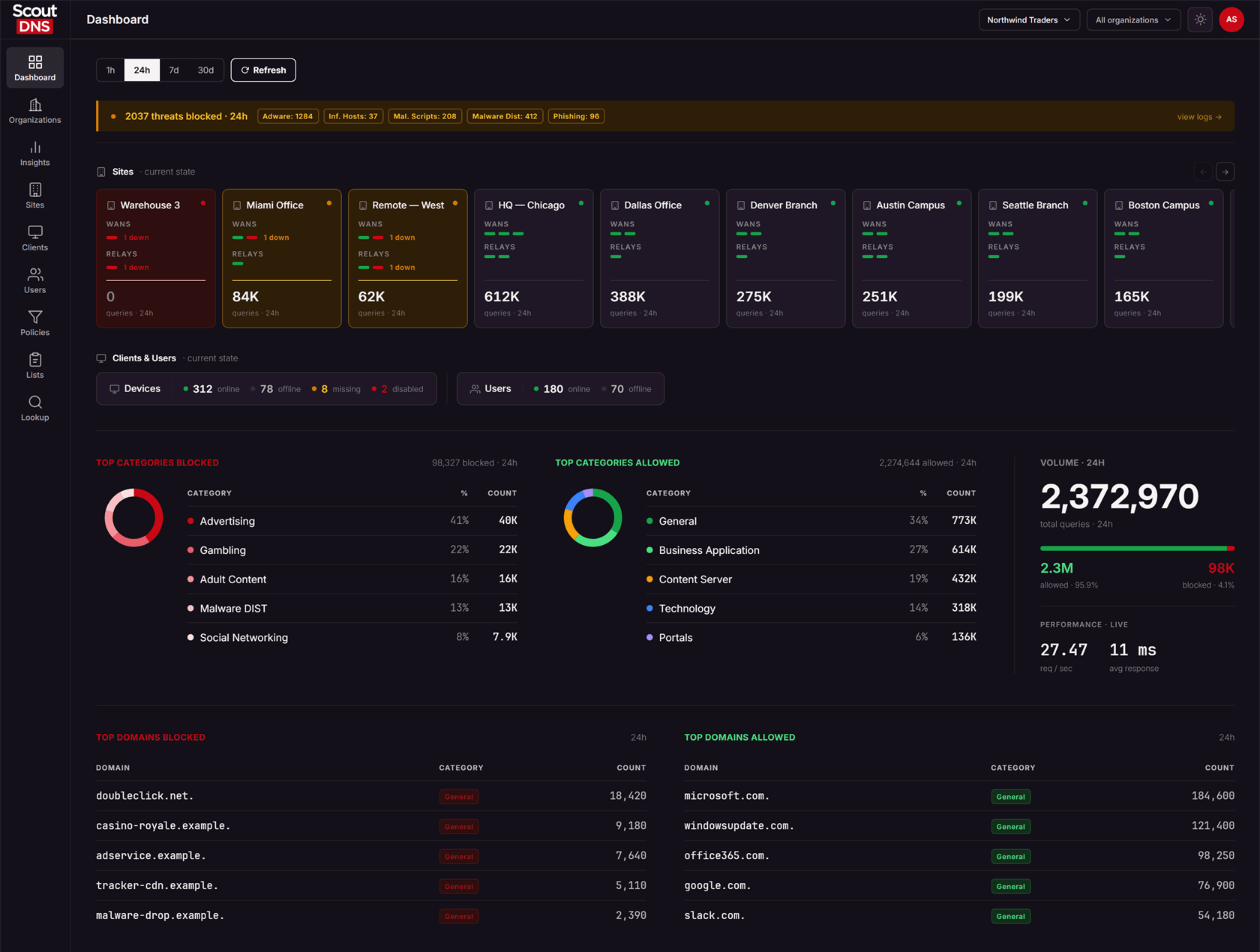
A tour of the ScoutDNS Dashboard: threat banner, site health, client and user counts, top categories and domains, with links into Insights.
The Dashboard is the landing page after you sign in: a single-screen overview of your account’s security posture and DNS activity. Reading top to bottom, it answers three questions: are there active threats, are my sites and agents healthy, and what traffic is being allowed and blocked. Every activity panel links into Insights for deeper investigation.
If your account has organizations, the organization selector in the header scopes everything on the page to the selected organization.
Page layout
From top to bottom:
- Controls row, with the time range selector (1h / 24h / 7d / 30d) and a Refresh button.
- Threat banner, a green all-clear line or one to two alert rows.
- Sites strip, horizontally scrollable cards, one per site.
- Clients & Users strip, device agent counts and directory user counts.
- Top Categories Blocked / Top Categories Allowed, a donut and top-5 table each, plus a Volume panel.
- Top Domains Blocked / Top Domains Allowed tables.
[!NOTE] The time range selector scopes activity data: the threat banner, category and domain tables, and volume totals. The Sites and Clients & Users strips always show current state. A site that was down yesterday but is healthy now shows green even on the 7d range.
Threat banner
The banner covers six monitored threat types: Adware, Infected Hosts, Malicious Scripts, Malware Dist, Phishing, and Malware C2.
- All clear: a green line confirming no detections in the selected range.
- Threats blocked: an amber row with the blocked-threat total and a count badge for each type that fired.
- Malware C2 detected: a separate red row shown when command-and-control detections exist. This one deserves immediate attention, it means a device on your network may be compromised and trying to phone home.
Clicking any alert row opens Insights pre-filtered to the relevant threat categories, carrying the dashboard’s time range, so the numbers you land on match the numbers you clicked.

Sites strip
One card per site, showing the site name, a status dot, one bar per WAN (and per relay if the site has relays) with down counts, and the site’s query total for the selected time range. Clicking a card opens that site’s detail page. Arrow buttons scroll the strip when there are more cards than fit.
Site status rolls up as follows:
| Status | Meaning |
|---|---|
| Healthy (green) | Every WAN and relay is up |
| Degraded (amber) | At least one path is up, but a WAN or relay is down |
| Down (red) | No path is up: every WAN and every relay is down |
Cards are sorted worst-first, so problem sites are always visible at the left of the strip without scrolling.

Clients & Users strip
The Devices card summarizes your whole agent fleet with four counts:
| Count | Meaning |
|---|---|
| Online | Agent is connected and filtering |
| Offline | The agent signed off normally, for example the machine was shut down |
| Missing | The agent stopped reporting unexpectedly. Shown amber, worth attention |
| Disabled | The agent was intentionally turned off by an administrator. Shown red because filtering is not protecting that device |
The Directory Users card shows how many directory users are online and offline right now, across your connected directories (Active Directory, Entra ID).

[!TIP] Missing and Disabled are the two states to watch. Missing devices stopped reporting without signing off; disabled devices are running unprotected by deliberate choice, which is easy to forget to undo after troubleshooting.
Categories, volume, and domains
The Top Categories Blocked and Top Categories Allowed panels each show a donut plus the top 5 categories with share and count. Hovering a donut segment shows its percentage. Clicking a row opens Insights on the Category tab filtered to that category and result (blocked or allowed), carrying the dashboard’s time range.
The Volume panel on the right shows total queries for the range, an allowed/blocked split bar with counts and percentages, and live performance: requests per second and average response time.
The Top Domains Blocked and Top Domains Allowed tables list the top 5 domains with their primary category. Clicking a domain’s category badge opens Insights filtered to that category and result.
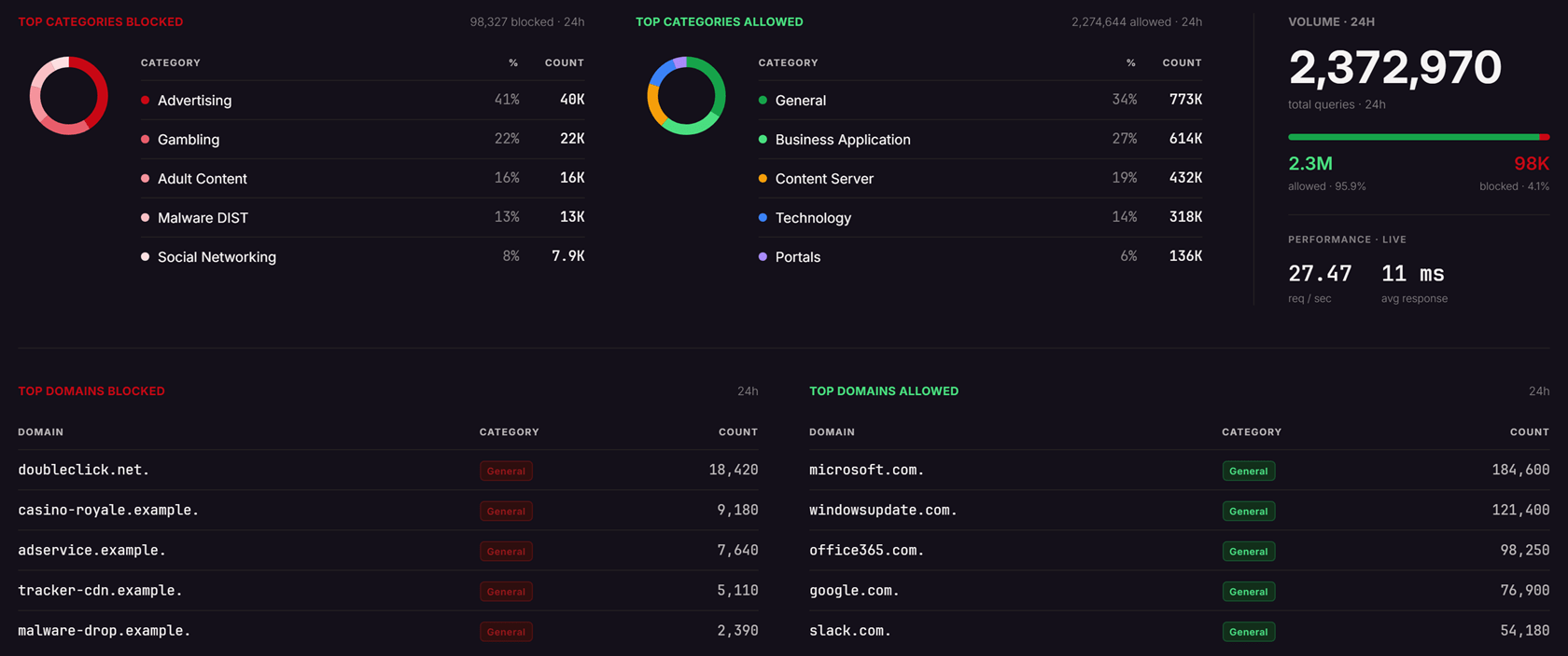
[!NOTE] The two performance numbers (requests per second, average response time) are live values reflecting the current moment, regardless of the selected time range. They show a dash when no data is available.
FAQ
Why does a site show healthy when it was down earlier today? The Sites strip always shows current state; only activity panels honor the time range. Use the site’s detail page for outage history.
Why don’t my dashboard numbers match what I see in Insights? They should. Every dashboard click-through carries its time range and filters into Insights. If you navigated to Insights separately, check that the time range matches; Insights defaults to Last Hour.
What’s the difference between an offline client and a missing client? Offline means the agent signed off normally. Missing means it stopped reporting without signing off, which can indicate a crashed service, a removed agent, or a device that lost connectivity unexpectedly.
Related
- Insights overview, the analytics explorer every dashboard panel links into
- Roaming clients (device agents), installing and managing the device agents the client counts report on
- Active Directory policies and Entra ID policies, the directory connections behind the user counts
- Working with policies, what determines blocked vs allowed